Orchestrating Identity: Optimising onboarding
For this project, I was hired by Orchestrating Identity, an identification authentication startup, as a Product Designer to assist their front-end development team with their early stage MVP. The tool they were developing was an onboarding flow that uses photo ID analysis and video biometrics to verify users' authenticity. It also needed to support white labeling with light branding, allowing it to fit seamlessly into existing branded apps and websites.
Problem
The team had been working in stealth mode on this project and was starting to scale up. With a new front-end developer joining, they wanted to refine their initial work and create a comprehensive set of front-end tickets to advance the product to a market-ready state.

A view of the UI's I was shown initially
Research & Analysis
Together with their tech team, we reviewed the existing prototype and mapped out the user journey to get an overview of the experience so far. This analysis helped us pinpoint areas where the onboarding process could be enhanced.
The current prototype lacked clear descriptions to guide the user, making the multiple ID checks feel disjointed and confusing at times. We discussed a plan to implement some UX best practices around onboarding to enhance user comprehension.
Additionally, the UI's theming used the brand colour liberally on the background element. While this might not look bad in some cases, it could easily look garish with certain brand colours.

Our first call to kick off the project
Proposed Flow
With the current flow in hand and an understanding of the processes we needed the users to follow I came up with a flow for their team to implement. This new flow focused around an 'Overview' page that would inform the user the process and at what point they are currently in it.
Once a user had signed the T&Cs and added their personal information, they would land on this new 'Overview' screen that would guide them through the process. Once they start an 'Activity' (Biometrics or ID processing) the user is shown what's going to happen before they jump into the task.
If the user finishes an 'Activity' and has more to complete they will loop back through the 'Overview', with the conformation that that prior step is done. Otherwise the user will end up at the 'User verified' screen to complete the process.

Wireframe of the proposed onboarding flow
UI Design
With the flow adjusted and then agreed upon, I moved into UI design. I used a Figma UI system (for the form and button elements) to save time and build my mockups in high fidelity. As an onboarding flow we kept the templates as static as possible; replacing the content in the forms and adding additional cards.


Terms — This was a requested to be up front from the client, so no data is processed until the terms are signed off.
White Labeling
To help the authentication flow fit 3rd party experiences it needed to be responsive and white labeled. To make sure that brands could achieve cohesion we came up with some rules:
- Use system fonts — Allowing custom brand fonts was out of the question, so we settled to use the system font to blend in whatever platform the user was on.
- Forced aspect ratio for the logo — This keeps the logo unified across all platforms. After development started a square ratio was decided, so that we could suggest to users to pull theirs from their social platforms.
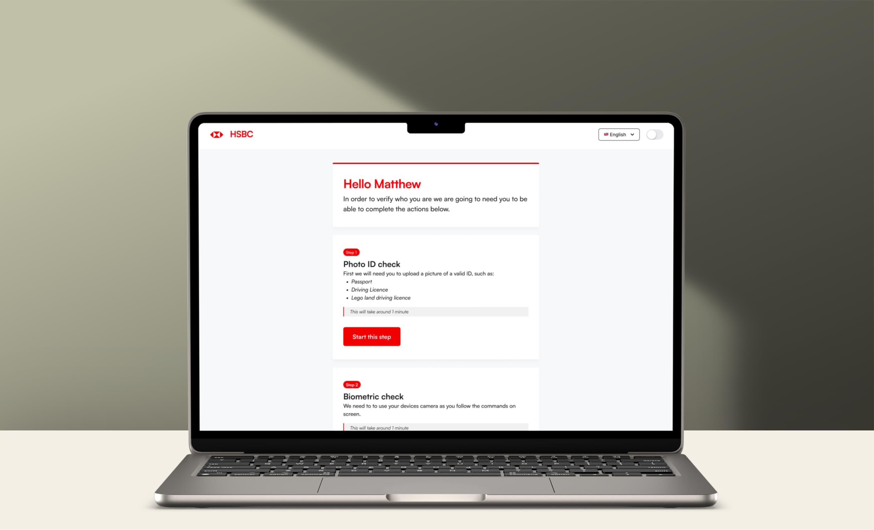
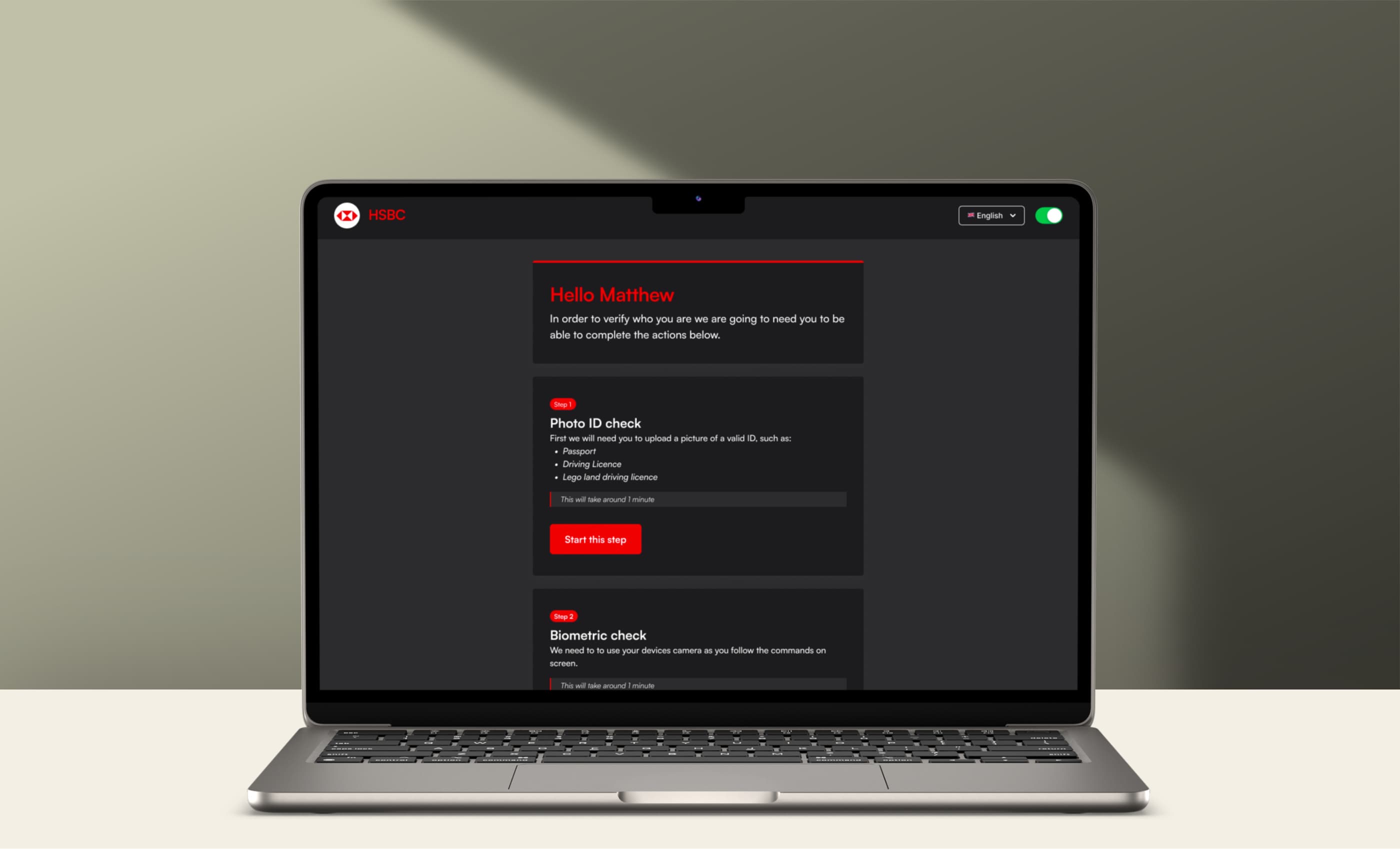
- Simple colour options — For colours we only allowed 2 options: The brand colour for the top bar and button to add a big splash of the brand on the UI. Followed by a Heading colour, that could be set to brand, brand secondary or a darker colour as needed.

Mockups to show how the flow could adapt to any brand
Handoff
Using Figma I created a file for the font end team use. This had the proposed flow, UI mockups, and examples of how the white labeling would work. We used this file to discuss further details during development and made further edits based on issues that arose once work began.

The final results
The Final Results
Through collaborative research and analysis of their current offering, we identified key areas for improvement in the onboarding process, ensuring a more seamless and user-friendly experience. By implementing clearer instructions, an overview screen, and refining the UI theming, we aimed to create a tool ready for market.